
Data-backed decisions are more valuable than ever. In fact, insights-driven businesses grow on average more than 30% each year.
Still there are challenges for data-driven companies:
- Defining success
- Having data accessible team-wide
- Breaking down data so that it’s easy to understand
Meet your goals and stay aligned on performance by developing insight-driven dashboards.
If you’ve ever had to work purely off assumptions, you can’t feel confident in your direction.
When your team’s looking to drive results, dashboards help you make data-driven decisions that support your goals.
Discover how dashboards can provide real-time insights that keep your team on the same page.
Table of Contents
What is a Data Dashboard?

A data dashboard is an information tool that visually tracks and displays key performance indicators (KPI) based on a set of specific business objectives.
Dashboards take data collected over time from various data sources, APIs, your files, your organization’s app accounts, and any other database you choose to track. Your dashboards translate that data into tables, line charts, bar charts, and other visualization appropriate for each data type.
What is the Purpose of a Dashboard?
Not all dashboards serve the same purpose. In fact, dashboards have a range of use cases. Dashboards help:
- Business leaders have a quick reference source for monitoring KPIs
- Managers and employees make data-driven decisions and track department-level and individual KPIs
- Agencies share the results of campaigns and stay on the same page with customers through white label reporting
By tying KPIs to specific business goals, you can set benchmarks and measure your version of success.
Why is a Dashboard Important?
Revenue. Lifetime value of your customers. Churn rate. These are all metrics you can track. Plotting these metrics over time allows you to identify positive and negative trends in your business efforts and inform your strategies.
Dashboards allow each stakeholder to know the analytics that matter to their business, department, or project. Even non-technical users can quickly compile data and be able to spot trends through the visualization options in dashboards.
Dashboards provide a real-time overview of your KPIs through visualizations including tables, line charts, and bar charts.


The intuitive design of dashboards lets you quickly analyze and share specific performance metrics. That way, teams can take immediate action on emerging issues if needed. Plus, everyone that needs to see key metrics can without potentially altering the data.
For example, If you’re a marketing manager presenting to your executive team, you know you need to show results. A dashboard set up with the right data sources can tie your website performance to revenue and sales.
What are the 6 Benefits of a Dashboard?
In case you need to get buy-in on your team, here are the top six benefits of a dashboard:
- Provide an objective overview of how you or your department are meeting goals
- The graphs generated in dashboards are easy to understand and quickly spot trends
- Prevent data silos and keep teams aligned
- Leverage historical and real-time data to help with budget allocation and other resource planning
- Bring together all your data from multiple sources into one central location
- Quickly customize dashboards based on a variety of factors including individuals KPIs or a specific period
Let’s say you want to see the effect of a new product release teamwide. You can review:
- How many new deals your team wins post-product release
- The impact on customer satisfaction scores
- Your cost per acquisition on ads since your new product came out
You can bring all of these insights together in a single dashboard.
Dashboards Versus Reports
Dashboards and static reports both offer different types of value to the end-user. Some executives prefer information delivered to them on a timely schedule. Others prefer to have an easily accessible up to date entry point to their data at any time. Some like a combination of both.
Unlike static reports, with real-time dashboards, the data automatically refreshes from the source. Dashboards can save time by pulling in historical data and comparing with the most up to date information. Simply share the live dashboard’s URL with your stakeholder.

You also don’t have to go into multiple sources to gather and track data. Dashboards provide a more efficient reporting tool than spreadsheets or most platform’s built-in reports.
Pulling a report from Google Analytics, QuickBooks, Facebook Ads, and Campaign Monitor doesn’t have to be a couple of PDFs in a row. You don’t need to have an employee photoshop the graphs that are relevant. Dashboards allow you to take those data sources and display them in concert with each other.
If you still need more traditional reports though, the best dashboard platforms give you the option to export or schedule automatic email reports.
| Dashboard | Traditional Reports |
|---|---|
|
Real-time data |
Static data |
|
Share via URL, PDF, email |
Share via
PDF, email |
|
Contain visualizations |
May Contain Visualizations |
|
Contains Multiple Data Sources
|
May Contain Multiple Data Sources |
How Does a Dashboard Work?
A dashboard lets you review multiple data sources in one central location so you can:
- Monitor and analyze your most important metrics
- Identify trends and make more informed decisions
Widgets are where you can specify which data sources and KPIs you display in your dashboard. The example below is the number of unique users over a 30 day period pulled from Google Analytics.


Then you can set alerts to monitor metrics and deliver notifications when specific conditions occur, such as your Facebook Ads click-through rate plummets.
Plus, create widget goals to benchmark metrics against your business objectives. For example, you can see if all your sales reps hit their monthly quota.
What Do You Put in a Dashboard?
Selecting what data displays in your dashboards starts with your goals.
- Establish a specific, measurable goal. Consider if there is any existing benchmark data to help confirm your goal is attainable.
- Select the metrics and the data source that measure progress towards this goal.
- Identify list the different types of dashboards you need to track your company, team, or individual goals.
What Types of Dashboards are There?
Many individuals create dashboards based on their role within a company including:
- Executive dashboards to review high-level KPIs
- Marketing dashboards for everything from web analytics to a Facebook Ads dashboard breaking down your campaign results
- Sales dashboards to track win rates, deal sizes, and other important sales performance metrics
- Client dashboards so agencies can share their results
How Do You Create a Dashboard?
In Cyfe, you can select to build a dashboard from scratch or choose a pre-built dashboard.
To add a pre-built dashboard:
- Log into Cyfe and navigate to the top toolbar.
- Click on the “+” symbol (“New Dashboard”).

- Choose “Templates”.

- Configure each card by hovering over each widget. Select “Configure” and provide your account information.
You can also start your dashboard from scratch by clicking “Add Widget” at the top toolbar:

- Choose integration you’re looking for from the tabs.

- Confirm the integration you want to add by selecting “Add”. x
You can customize any dashboard by:
- Setting a default date range. Anytime you visit your dashboard, that will be the date range that initially appears.

- Moving around and resizing widgets

- Adjust the data displayed in your widgets without updating the default range. Set a desired date range by selecting the calendar icon and choosing from the available dates.

- Update the data shown without affecting the default date range by selecting the Daily/ Weekly/ or Monthly buttons. These settings will adjust the data to represent a daily, weekly, or monthly summary of the widgets in your dashboard.

How Do You Design a Dashboard?
Well-designed dashboards incorporate UX principles. To start designing a dashboard, identify who will be reviewing the dashboard and the goals of creating it.
Place your most vital metrics in the top, left corner. Like reading a book, subsequent metrics should flow left to right to make analysis easier.
Consider sticking to a single screen to improve the UX with the initial dashboard view.
A few other design tips to keep in mind:
- Select a few colors to use on your board. Check out these color palettes below and visit Color Hunt for more ideas.

- Use one font per dashboard to keep the design clean.
- Adjust a widget’s size to highlight the most vital metrics.
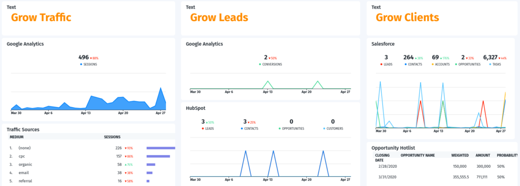
Dashboard Examples
Use any of the examples below as springboards for your dashboard.
Analytical Dashboards

Analytical dashboards present key metrics reflected against previous performance. Gauge individual or team-wide performance including:
- Customer satisfaction scores and agent-level performance in Zendesk
- List growth and click-through rates on MailChimp, Constant Contact, ActiveCampaign, and GetResponse
- Opportunities won and other data in Salesforce, HubSpot, or other sales CRMs
Business Dashboards
Business dashboards can provide anyone in a leadership role a way to review high-level KPIs such as:
- Income and expenses logged in QuickBooks
- Sales via Shopify or Eventbrite
- Conversion rates on different ad networks
Platform Dashboards

Platform dashboards provide access to real-time data from specific social platforms including:
- Engagement on Facebook, Twitter, LinkedIn, YouTube, or Instagram
- Ad spend and conversions on each social platform’s ad network
- Website traffic generated from different social channels measured in Google Analytics
Summing It Up
You don’t need to be an analyst to use and understand the data in a dashboard. Anyone can use a dashboard to make more informed decisions and monitor KPIs.
Dashboards can also keep everyone aligned whether you’re sharing the most relevant metrics with your clients or connecting remote marketing and sales teams.
Your dashboard can adapt as your goals progress over time. Keep in mind though you may need to adjust your KPIs and data sources.


