The contact form is usually seen as an afterthought — a quick “for more information, contact us” line you throw together while creating your website.
Truth is, your contact form is valuable website real estate that welcomes people to your company, creates a first impression, encourages someone to reach out, and turns anonymous website visitors into qualified leads.
Aside from writing a catchy call-to-action, how else can you optimize your contact us form to make the most of your marketing efforts?
Table of Contents
What is a contact form?
A contact form is a set of questions on your site that lets visitors reach out to customer support or a person from your company. Often, a contact form is placed at the bottom of key website pages to capture lead information.
Your contact can include a short message encouraging website visitors to reach out, field forms to collect information such as name, email, etc., and a call-to-action. Remember, your contact form is what people look at when deciding to contact your business or not — so make every piece of information you collect count.
What your contact form needs to achieve
It may not seem like you have much room to work with when you consider everything your form should accomplish. Useful contact forms will:
- explain why the website visitor should contact you and motivate them to get in touch
- avoid necessary information, focusing on explaining how someone can communicate with your company
- showcase your brand’s personality, matching your style and voice to the rest of your site and social media profiles
- offer a few ways to contact you, whether it’s through Live Chat, Messenger, phone, or email
- set the right expectations for visitors, reassuring them you’ll contact them back.
Fortunately, there’s are ton of different ways you can boost the effectiveness of your contact form, and create a lead generation process that helps visitors quickly get in touch with your business and take further action. The tips below will help you convert more site visitors with an optimized contact form.
How to create the best contact form for your site
Since you only have a limited amount of working space, there are a few objectives you should prioritize in your contact form before you send it live.
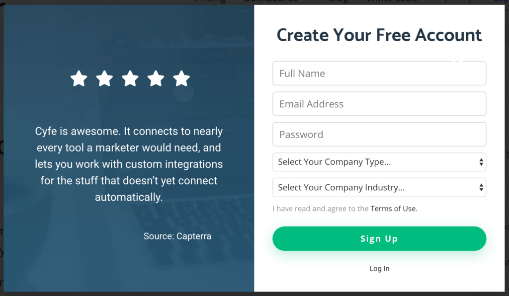
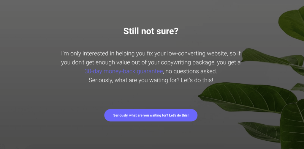
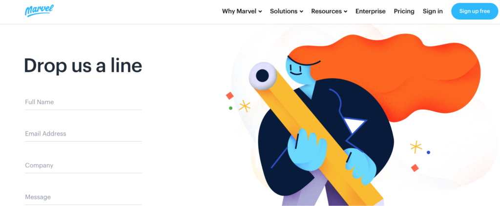
1. Show visitors your brand’s personality
Your contact form doesn’t have to be just fill-in-the box fields. You can make it stand out by:
- using one call-to-action (CTA) that prompts an email.
- asking a question in your headline
- re-ensuring prospects they’re in good hands with a guarantee
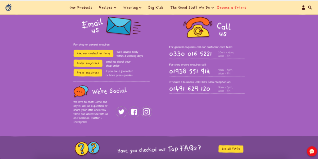
2. Add social media links
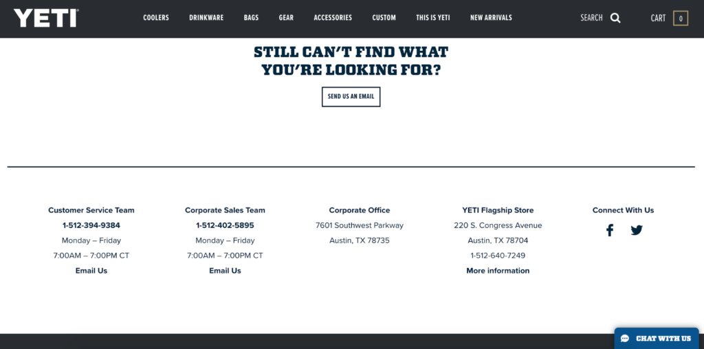
This actively encourages potential customers to get in touch on channels they’re most comfortable, plus, can get drive traffic to your social platforms for further discovery.
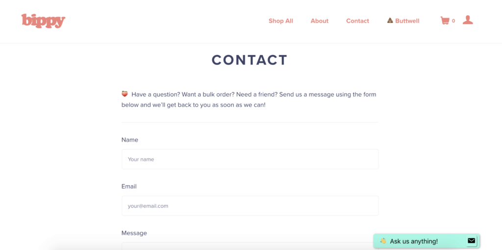
3. Create a visually appealing form to encourage contact
4. Consider a full contact page
5. Personalize your contact form
Personalization is an essential part of your contact form, and using the word “you” can help improve conversion rates. You can go more in-depth with logic and dynamic content, but leveraging good messaging can be equally as effective.
6. Collect relevant lead information
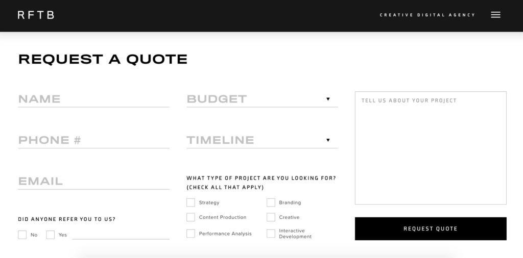
- business type
- website URL
- company name
- job role
- number of employees
Contact form ideas: 5 Best Examples
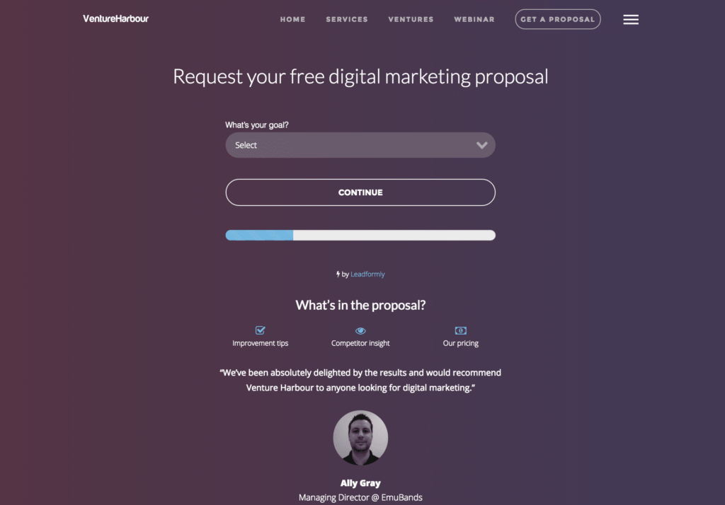
1. VentureHarbour
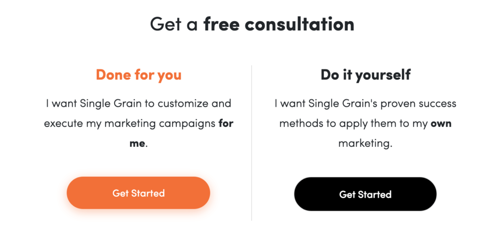
2. Single Grain
3. Marketing Automation Insider (MAI)

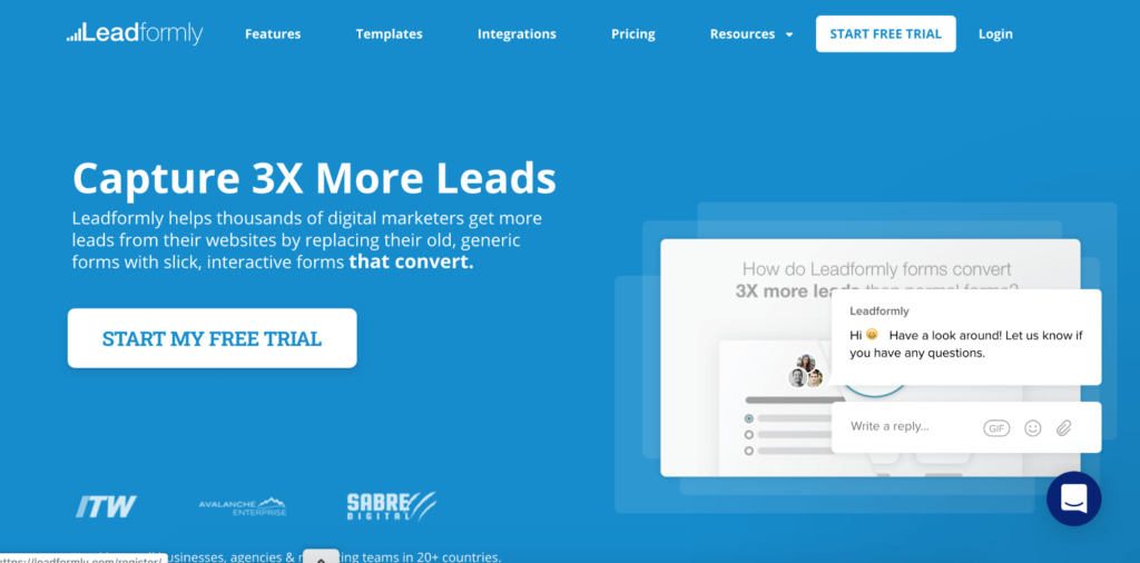
4. Leadformly
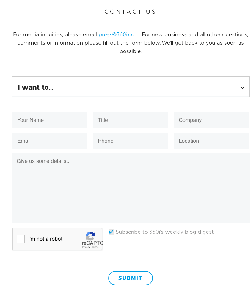
5. 360i
Making the most of your contact form
As you go on creating lead generation processes and updating your website — be sure to keep your contact form in mind. Potential leads are bound to fill it out if they feel they’ll get value out of it.
With these contact form tips in hand, you can make a powerful impression on behalf of your company and convince website visitors to get in touch with someone from your team.