Data is beautiful indeed. Not only can you beautifully illustrate data, visualization also helps you more effectively communicate metrics.
But what data visualizations are setting higher standards in 2020? With the below best data visualizations of 2020, you’ll see how data visualizations can:
- Highlight specific causes
- Provide vital information so people can make informed health choices
- Illustrate trends over time
- Pinpoint issues backed by data
Table of Contents
1. Coronavirus Riskiest Activities
Data visualizations can break down large amounts of information into an easily understood way. With the pandemic came many ambiguous situations where people weren’t aware of how much they are at risk.
The below data visualization by Information is Beautiful breaks down popular activities by the level of risk.

Data Source: New York Times, Reuters, NPR, SF Gate and others
Data Metrics: Risky activities ranked lowest to highest
2. Identifying Generational Gaps in Music
Visualization can also be an immersive experience. The digital publication The Pudding created a multimedia quiz where site visitors:
- Provide their birth year so The Pudding can recognize what generation each visitor is a part of
- Listen to clips of music and state whether how much they recognize a song from the 1990s as it plays
- Below the multiple-choice answers, anyone can see the percentage of each generation that knows the song

Data Source: First-party data gathered from users who complete the quiz
Data Metrics: percentage of people who recognize a song
The visualization is clear so that users know it’s a timed quiz and can see their answer history.
According to BuzzSumo, this visualization is the most shared content from pudding.cool with over 9,000 engagements.

3. V. Analytics' Trending Google Searches 2018-2020
The most upvoted r/dataisbeautful post this year isn’t a meme. It’s an effective time lapse of the top Google trending searches by state each day from 2018 to 2020.

Data Source: Google
Data Metrics: Google Trends search data
4. Demographics of the United States Congress
These pie graphs posted to r/dataisbeautiful use multiple data points compiled via spreadsheet to show how much state reps accurately reflect the US population. Anyone can see how demographics including religion, race, and gender compare with each political party.

Data Source: Pew – Faith on the Hill Pew Religious Survey, Congressional Research Service, US Census Congressional Research Service, and US Census
Data Metrics: Religious, ethnicity, and gender demographics
5. How Much Football is in a Broadcast Game
Everyone’s trying to be smarter with their time. A Five Thirty Eight article visualizes data to show how much action each pro sports league airs compared to game stoppage and commercials.

Data Source: University of Texas at Austin Sports Analytics Course
Data Metrics: Total time in minutes airing game action, non-action, and commercials
The distinct color palette helps make this graphic visually appealing.
6. Overall Inflation Versus College Tuition Inflation
A simple line graph can also say a lot based on the data. In this case, you can see the Chartr graph below shows college tuition rates outpace inflation.

Data Source: US Bureau of Labor statistics
Data Metrics: Inflation rate
7. How to Profit in Space: A Visual Guide
Beyond SpaceX, companies are looking beyond earth at business opportunities. This data visualization guide by the Wall Street Journal looks at satellites in orbit by originating country and use.

Data Source: US Space Surveillance Network, The Union of Concerned Scientists
Data Metrics: Satellites in orbit from specific countries and by usage
8. YouTube Channels Then & Now
The below data visualization looks at the top 100 YouTube channels last year compared to 2010. As a second data point, it also factors in how many more of the top channels today are from brands like WWE instead of individual producers. Though minimalist in design, the visualization leverages YouTube brand colors.

Data Source: Wayback Machine and SocialBlade.com
Data Metrics: YouTube channels with the most subscribers that are a YouTuber, mainstream celebrity, or corporation
Monitor data from your own channel using our YouTube dashboard.
9. The Effect of COVID-19 on Unemployment
This animated data visualization shows unemployment figures across the US at the height of the pandemic. Commercial real estate software company Sites USA used After Effects to show the data progression.
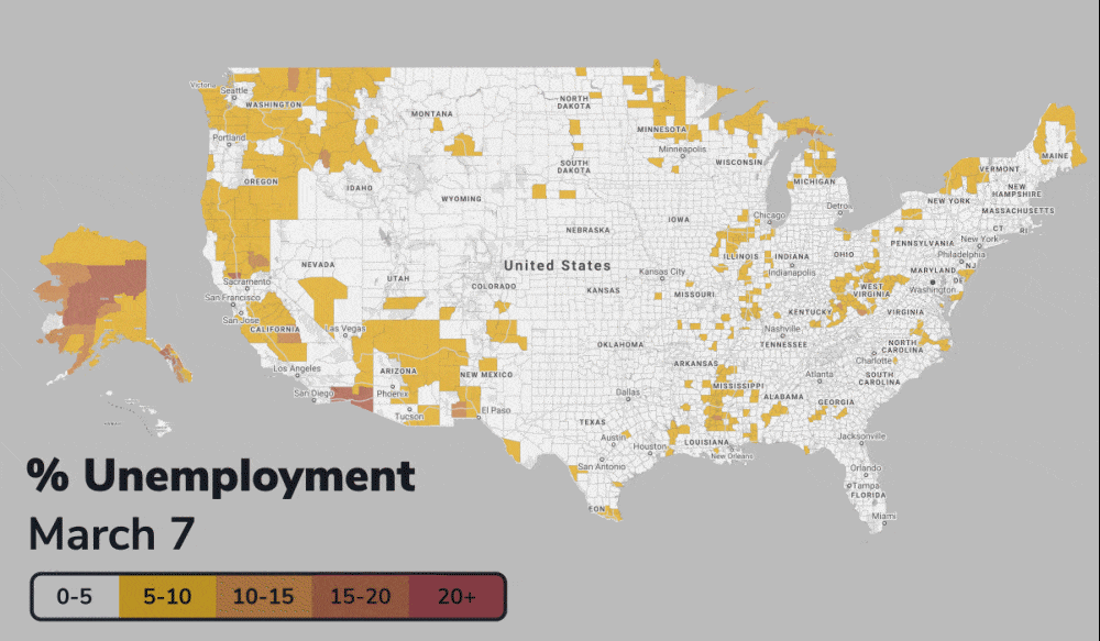
Data Source: Sites USA
Data Metrics: Unemployment rates by US county
10. Global Commodities
A spinning globe showing different commodities and locations is a natural fit. Clicking on any country on this interactive data visualization by Data FX shows the:
- Gross amount for imports or exports
- Global share as a percentage
- Rank compared to other countries
Their site contains data on imports and exports spanning the last ten years.

Data Source: UN Comtrade Database
Data Metrics: Gross imports and exports ($) along with global share and rank
11. Most Popular Programming Languages
YouTube content creator Pie Chart Pirate put together this breakdown of the most popular programming language based on GitHub data. The pie chart looks at data starting in 2012, showing the decline in Ruby and emergence of Go as a programming language.

Data Source: GitHub
Data Metrics: GitHub pull request data
12. Public Companies Receiving PPP Loans
Companies are also using data visualization to keep publicly traded companies accountable.
After JP Morgan announced they are investigating the misuse of pandemic funds, Quiver Quantitative created a visually appealing bar graph with complementary colors showing public companies that received PPP loans and either returned the loan or did not.

Data Source: US Department of Treasury
Data Metrics: Market cap in millions and whether each company returned or did not return PPP loan
13. Disney Revenue Streams
Chartr used data from SEC filings and MacroTrends to share Disney’s revenue totals. The bar graph is effective because they provide additional context including:
- How much their brand grew in revenue after Bob Iger stepped in as CEO
- 2019 revenue totals with the percentage of specific revenue streams

Data Source: SEC filings and MacroTrends
Data Metrics: Revenue by year and 2019 by revenue stream
14. Symbolikon
Michela Graziani created a large set of designs featuring ancient symbols from different civilizations throughout history. Symbolikon’s home page features the below visualization incorporating muted colors and an interactive map.

Data Source: Symbolikon
Data Metrics: Ancient symbols by origin
Site visitors can click on any icon within the map to find whether the Incas or another society used the symbol. Anyone looking to design with these symbols can purchase and download them.
15. Homelessness on the Rise in the UK
Data visualizations can also bring to light larger social issues. Viz for Social Good worked with Tomorrow Today, a nonprofit committed to ending homelessness, to create a series of graphics highlighting the homeless in the UK.

Data Source: CHAIN and various local authorities
Data Metrics: Vacancy rate and rough sleepers
Over 200,000 people have viewed the visualizations.
16. COVID-19 Hot Spots
With so many different data sources available, it can be tricky to try to decipher what’s going on. New York Times compiles the current hot spots by county across the United States via data from different state and local agencies.

Data Source: State and local agencies; population and demographic data from US Census
Data Metrics: Weekly cases by county
The legend above the map makes it easy to navigate and any site visitors can also highlight a specific county to view 14 day trends on the number of COVID-19 cases. Anyone viewing the data visualization can also toggle between total cases, deaths, and per capita.
17. Wealth Shown to Scale
Data visualization can also serve to communicate specific items. This graphic lets any site visitor scroll to see Jeff Bezos estimated net worth. His $200 billion in wealth is shown with a ruler-style length at the bottom, with $80 million representing the equivalent of an inch.
As any user continues to scroll, they can clearly see how much that truly is.

Data Source: Forbes
Data Metrics: Wealth of Jeff Bezos and richest people in the world
18. Data Grammar
Data Grammar contains a glossary covering different types of data visualization. Complimentary colors help show why specific charts work best based on the scenario. Black and white images seamlessly weave into the accompanying graphics.

Data Source: Juillet Juillet
19. Migration Waves
National Geographic looks at the migration patterns over the last 50 years with this infographic.
A few conclusions from this data:
- Less than 10% of migrants are forced to flee
- Most migrants are seeking a better life and move only when they can afford to

Data Source: National Geographic
Data Metrics: Emigration by number of people in a given year and country
The wave patterns in the graphic are both functional and aesthetic. The waves show increase while National Geographic uses their core brand colors of yellow, black, and white here.
20. Movies Critics Loved, But Audiences Really Didn’t
The biggest disparity for the Rotten Tomatoes Score between critics and audiences happened with the release of the Last Jedi. 93% of critics gave it a positive review, other viewers averaged a 56% score. The scatter plot graph by Information is Beautiful looks at other major film releases where big disparities occurred.

Data Source: Rotten Tomatoes
Data Metrics: % gap between audience and critics for Rotten Tomatoes of various films
Summing It Up
As you can see from these examples, visualizations create clear conclusions that anyone can quickly get. Still, the best data visualizations are only as good as the data displayed.
Use the above examples and Cyfe’s dashboard templates as a springboard to help you identify the most important data you can share, whether it’s for your personal life or business KPIs.


