
Whether you’re a marketing manager at a big company and manage data, or a solopreneur managing multiple clients’ data at once, you need to prepare data for analysis.
A good approach to data preparation can help you generate new insights, find connections between your data, make smarter business decisions, and so much more.
Here are ten practical best practices you can use to make preparing data for analysis easier.
10 Best Practices
1. Set a clear goal
The level of impact you can have when analyzing your data is dependent on setting the right goals. Goal setting is a good way to reflect and think about what you’d like to get out of your data. It also helps streamline analysis when you’re tackling a huge batch of data.
When setting goals for your data, you need to define a problem statement. For any outcomes to succeed, the reason must stem from a problem describing the reason for change and a way to measure success.
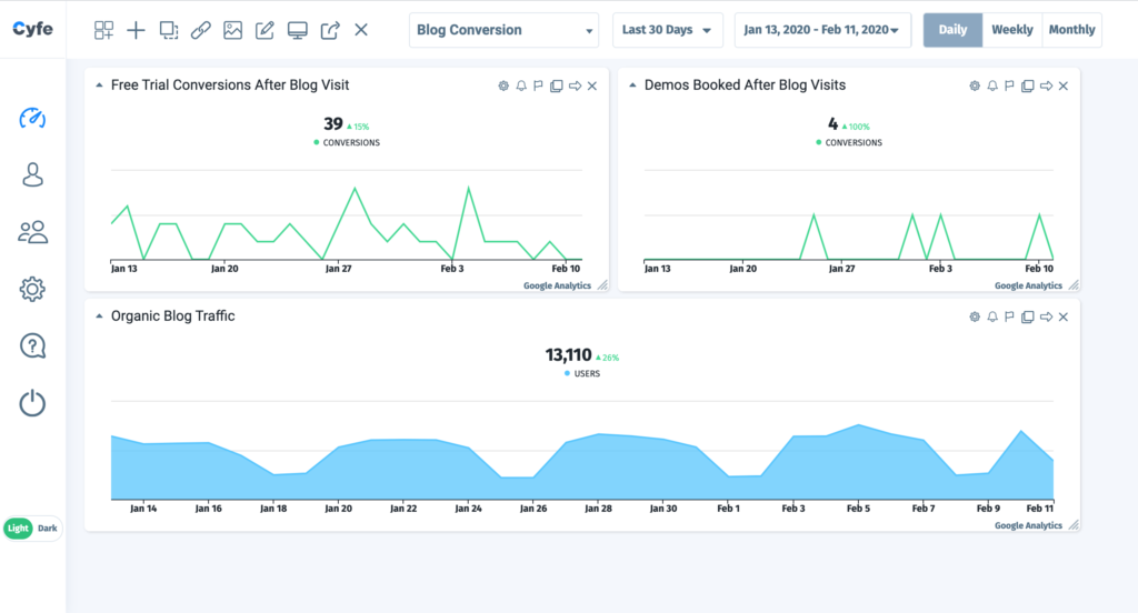
For example, a SaaS company saw that the blog conversion rate was lower than it should be (problem), suggesting issues with poorly optimized contact forms and bad content (symptoms). The solution, in this case, could be to analyze conversion metrics on high-goal completion pages, and compare it to declining ones.
Goals are strategic and aspirational, they tend to have a much higher impact over time. The more organized your approach for preparing data for analysis is, the easier it’ll be to solve problems at a faster rate. It also keeps your data team on the same page and helps you carry out work in measurable strides that get results.
2. Prioritize data visualization
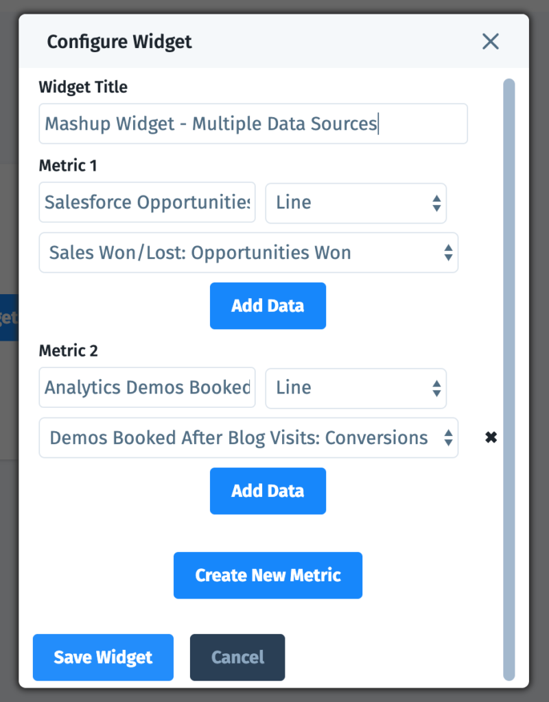
When preparing data for analysis, it’s easy to get caught up in the numbers without considering the final presentation or even the data analysis review. Presentation or visualization matters, because this is how you, your team, and others view and interpret the data.
Here are a few tips on deciding the best visualizations when preparing data for analysis:
- Choose the right format to communicate the main purpose. One size does not fit all. Carefully decide on the best graphs, charts, and layout to tell your story and answer questions generated by the data.
- Use color cues to help tell your story. Colors can be tricky, but finding a good balance on your board can help highlight and accentuate key information.
- Use sizing to indicate value. You can alter the size of certain data points to stress importance. For example, net revenue or sales closed on a sales dashboard will be bigger than X
The wrong type of visualization may result in a skewed perception of the data or even eliminate certain questions from being asked, let alone answered. You want to make sure your future data is easy to navigate. Take the time to consider visualization when preparing data for analysis.
3. Don't ignore issues outside the scope of data
Sometimes there will be other measures beyond digital performance that come into play. It’s all too easy to allow data to inform every business decision, leaving gut instinct and ethical trailing behind in the dust. While data is used to make more informed decisions, it’s never a good idea to only rely on numbers without considering outside factors.
When preparing data for analysis it’s best to think of data as a motivator or influencer without final decision-making power. There may be ethical, cultural, or philosophical issues at play that may take precedence over pure data analysis. Be sensitive to these potential pain points to best understand how they may influence your final results.
4. Automate data entry to reduce human error
It’s possible you can make a mistake in basic data entry. Entering or merging information in the wrong row or column or adding an accidental zero at the end of a number are all common human errors when preparing data for analysis.
The answer? Automated data entry. These solutions can increase speed and accuracy, making sure your operations are never slowed down because of a backlog or human error. When it comes to data analysis, any process that minimizes the risk of human error is a huge positive. Always look for ways to boost efficiencies and save time.
5. Analyze a large enough sample
The size of your sample dictates the amount of information you have, which in turn, determines the credibility and precision of your data set. While you can get away with working up analytics for a small group, they tend to produce more outliers with weaker correlation. The larger the sample you have, the more information — which in turn, means less uncertainty.
There are two ways to approach this best practice: one, wait until you have a bigger data set. Two, look at smaller data sets over longer periods of time. You can make more clear comparisons by looking over specific timeframes such as year-over-year or quarter-over-quarter.
6. Use consistent and organized naming standards
If your naming conventions are slightly askew, you can throw your whole data set off. Set up a simplified naming convention system before diving deep into analysis. Use terms that are clear and that will make sense to those with whom you plan to share your analysis.
Make sure everyone is aware of your naming conventions so that no one is guessing their meaning or making up their own. While seemingly simple, this is the kind of disorganization that often wreaks havoc on data analysis.
7. Beware of duplication
This may seem like a no-brainer, but data duplication is a common mistake people make when preparing data for analysis. Duplicating one input will inaccurately skew your data, resulting in corrupt predictions and poor decision-making. Be certain to “dedupe” your data in the preparation stages to be sure to remove any traces of duplication that may affect your data set.
8. Clean dirty data
When preparing for analysis, take the time to cleanse and clean your data. Excel-type formulas and macros can help identify errors in data that might make it corrupt. In addition to duplicate data, you want to identify outliers, incorrect data, missing data, or data that simply does not make logical sense.
Here are so ways you can clean your data in an Excel sheet:
- Eliminate extra space.
- Treat all blank cells.
- Remove duplicates.
- Convert text-based numbers in numerical.
- Highlight errors.
- Create a consistent spelling case (Lower/Upper/Proper)
- Change Text to Lower/Upper/Proper Case.
- Make sure everything is spelt right.
- Delete all formatting.
Unfortunately, there is no easy way to clean data fast and automatically. You’ll have to learn the basics, get in there and get your hands dirty.
9. Make data connectivity simple
If you’re working with any business data set, you probably have information coming in from various sources. You want to be certain that your spreadsheet or dashboard is pulling data from the correct source or sources and that the data is compatible with your data collection software.
Multiple data sources mean that there are many more chances for error. To avoid this, know your sources and manage them upfront when preparing data for analysis. This way you can aim to avoid any unnecessary surprises down the road.

Essentially you need to be sure that your computer is playing nicely with all of the data and with the computer or software that is housing the original data. Connectivity is key and you want to keep these data connectivity relationships as simple as possible.
10. Make sure your data is updated
Using outdated data could happen if there’s a problem with your data source integration or inputting. Pay close attention to timelines if you’re tracking and examining real-time data. Make sure you check all data is up to date across your platforms and you’re consistently pulling data from the same timeframe.
An easier way to prepare data
While there’s not much that’s especially easy about preparing data for analysis, there are tools to help safely and accurately automate much of the data preparation and integration process.
Luckily advanced all-in-one online business dashboards like Cyfe exist to eliminate most of the manual data preparation necessary for a fully-functional data review and report.


