
Data is really the only way to efficiently run your business. It’s as simple as that. We are in the age of data and whether we like it or not, there is enough data on each of us and our businesses to drown in. The evolution of business analytics has brought us to the point of actually collecting, monitoring, and optimizing our businesses based off of data instead of gut feelings, best practices, or in a worst case scenario, hopes and dreams.
The question that always comes up is the meaning of the data. What does it actually mean and why do you care? To be honest, there is a ton of data out there that you really shouldn’t care about and you shouldn’t waste your time on. But for the data that does matter, it’s important to really understand why it matters and how it can help you make decisions.
Once you’ve got a grasp of what a metric or data point is actually saying and why it matters to your business, the next step is to find patterns and correlations. It’s time to find the reasoning behind the analytics. Why is the data saying what it is? What impacted the results of this data? Could the data be skewed?
What you’re asking is essentially, why did the data end up this way? While it may seem like a very simple question, the answer is commonly very involved and complicated.
If you think about it, not many pieces of data that we collect and monitor for our businesses are independent. They’re almost all impacted by some other force. Our sales and revenue may be impacted by our Facebook page. Our landing page performance may be impacted by our email open rate. Our lead pipeline may be impacted by our Google Adwords – ok – that one definitely is.
What we are getting at here is that in order to take your data analysis to the next level, you’ve got to compare your metrics to get a truer picture of why the data is saying what it’s saying.
Enter the Cyfe Mashup!
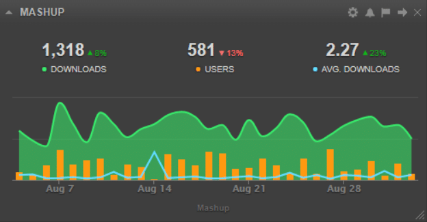
We have developed a new tool within your Cyfe dashboard that allows you to mesh (or mash, whatever you prefer) your data together to understand how, for example, your recent Facebook ad campaign impacted your sales in Quickbooks. The Cyfe Mashup tool can help you compare dozens of metrics against others so that you can start to spot trends and understand why your data looks like it does.
So how can you best use this new tool?
One of the main ways to effectively use the Cyfe Mashup tool is to use it to spot trends between seemingly unrelated items or loosely related data sets. The better you can understand which pieces of your business are affecting which other pieces, the better you can manage your business overall.
It is obviously different for each business, but if you start to see that when you’re posting a certain kind of content on your Instagram you see more traffic to your website or increased revenue, you can then take that information and understand that you need to produce more of that kind of content because it’s resonating with your audience and it’s leading to website visits and sales.
These trends can work the other way around too though. Maybe you find that when you send an email on Tuesdays your sales spike, but when you send emails on Wednesdays you don’t see the same kind of activity. That information lets you know that you should be sending your emails on Tuesdays instead of Wednesdays moving forward.
Really finding those trends by creating your own widgets (by incorporating data from already existing widgets) can help you take your business to the next level and the correlations that you find between different pieces of data will likely surprise you.
What about some of the extremely data heavy businesses like marketing agencies? Oh this tool is perfect for you!
There are several ways that the Cyfe Mashup tool can change not only the way that you study data for your business and your clients businesses, but also how you report on that data. Here are a couple ways that this tool can change your day to day work:
- It’s a new and better way to prove ROI
The easier and better you can show a direct correlation between your marketing efforts for your client’s and revenue, the longer your relationship will be with each client and the happier your client will be.
Now, with the Cyfe Mashup tool, you can show the relationship between, for example, your social media content creation and strategy to website traffic and revenue directly in a single widget. No more guess work – now you can clearly show what kind of impact you and your efforts are having for your client’s bottom line. - You can aggregate data from multiple clients to get a better understanding of your agency’s scope
From an internal perspective, you can understand the size and scope of your agency by understanding, for example how much traffic your client’s websites are getting by aggregating the Google Analytics data from multiple clients into a single widget.
Understanding this type of data can help you plan for your next round of hires or even help you to leverage a higher cost to your future prospects.
So how can you go about setting up your first data mashup?
In order to get started, simply select the Add Widget button as you normally would. The Mashup widget is located under the ::FEATURED:: and Custom sections. Add the Mashup widget and let’s start building!
Once you’ve added the widget, you’ll click Configure Widget like normal. The Configure Widget screen will immediately pull up the title for your widget and the first metric that you will pull into this mashup.
Be sure to label the first metric so you know what you’re looking at later and select any of the available metrics. As a note, in order to add a metric to a mashup, it must first already be created on at least one of your data dashboards.
Your next step is to select how you want the data reported. You can select from line, spline, area, area-spline, stacked area, column, stacked column, stacked percentage column, bar, and stacked bar. Essentially, you can make your data appear in any format that you’d like.
PRO TIP: Your different metrics do not have to use the same representation. Play with the different options to find the best format to display your mashed up data!
Now that you have added your first metric, you’ve got two options – add additional data or create a new metric.
When you add additional data, you can add, subtract, multiply, and divide an additional metric with your first metric. So, for example, you could add your followers from Facebook, Twitter, LinkedIn, Pinterest, and Instagram. All of that data would be added together and create one data set that is your total social media following on those networks.
When you create a new metric, you’re creating a new data set to be added to the mashup. This is used to compare different metrics and where you can spot trends.
You can add up to five metrics for a single widget and up to five pieces of additional content per metric.
This tool was really created to help each of our users (and even our team internally better understand our data and how different pieces of our data are impacting our overall picture. We really encourage you to build out your mashups so that you can spot those trends and make much more educated decisions within your business and even for your clients.
As an added note, you can also utilize our other new tools like the Cyfe Alerts and Cyfe Goals with your custom mashups!
We’re giving you the ability to take control of your data in a way that you have never been able to before. Our new tools were built to help you be a smarter and more informed business person. Take some time to set up each of our new tools and set up our brand new Social Media Publisher as well. All of these tools are now live in your dashboard!
Still not convinced that Cyfe is for you? Or maybe you’re not sure that you even need a data dashboard. Whatever your thought process, we encourage you to start with our free dashboard. There is no credit card required, no limited functionality, no trial period, no tricks, and no games – just a free Cyfe dashboard to use however you need! We are living in the data age thanks to the evolution of business analytics and we might as well use that data in order to better run, operate, and grow our businesses! Try it out today!