
If you’re about to create the perfect data dashboard, you have one goal: making data accessible to see and understand trends and patterns in your data. But of course, that’s easier said than done.
Knowing what you want to track — for example, business, marketing, and financial data — is simple. Communicating it in a way that isn’t overwhelming to clients and teams so they can take action on it, that’s the hard one.
To make it less complicated, we put together 10 tips to help you figure out what to report on, how you should report it, and how you can create a data dashboard that’s easy to understand for everyone.
Table of Contents
What is a data dashboard?
A data dashboard is a business tool that tracks, analyzes and displays vital data points, metrics, and key performance indicators from many sources. It’s a great way to get an overview of business health, department, or processes. And can be customized to address the needs of each department and company.
Top 10 tips for creating effective data dashboards
1. Know why you’re creating your dashboard
When it comes to building a data dashboard, ask yourself, “what problem does this board need to solve?” Forcing a dashboard when one isn’t needed is a great way to waste time and resources. Understand the purpose behind your board, your goals then what necessary metrics you need to identify, measure, and improve.
To start, focus on five to ten most important metrics and report on those per dashboard. If you do, you’ll have a clear understanding of when you’re adding value to the problem and when you’re not, and will help tell the true story to stakeholders.
2. Identify who’ll be looking at the board
Not all clients are created equal. They come in many different shapes and sizes, and can be looking for different metrics depending on their department. Defining your target onlookers will help you:
- Ensure you’re creating the right board, for the right people.
- Better understand how to communicate and act on the right data.
- Increase the likelihood people will receive your board well.
Start by asking yourself a few questions:
- What problems does this board need to solve? Most teams have some understanding of why they exist. Your data dashboard should be related to that purpose and align with the target group’s overall objectives.
- What metrics are most important to the target group? Choosing the right metrics depends on many factors like the type of offering or product, business model (B2C/B2B), industry (e-commerce/SaaS), job function (product/marketing/sales), and more.
- What does the group stand to gain from this dashboard? Great metrics lead to insights — which lead to actions and results. Write down what clarity observers will walk away with after looking at the board.
Once you answer the questions above, you’ll have a better idea of who’s looking at your dashboard and can determine how in-depth you need to go with tracking.
3. Place your most important metrics in the top, left-hand corner
Structuring content to read from left to right is one of the best ways to improve comprehension. Start by placing your most important data points in the top left-hand corner.
For example, the marketing dashboard below shows revenue, then moves into less critical data such as latest tweets:
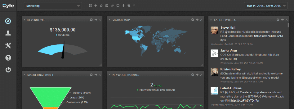
Consider this: if your viewer skips something or gets distracted, you want them to remember the essential details. You don’t want them to miss out on the good stuff because it lives in the wrong place.
4. Keep the design simple
There’s an old adage you may have heard that says “less is more,” but sometimes we forget when it comes to creating the best data dashboard. People get distracted, and it’s easy to overlook the data when there’s too much going on.
Some tips to remember when designing your board:
- Pick a few colors to use on your board
- Choose one font per client. Consistency is key to retaining information.
- Keep images to a minimum. Add a client logo if necessary.
- Use sizing to express more important data points. Larger widgets attract more attention than small ones.
The Web Analytics board below, for example, uses a simple light theme to show their site metrics:
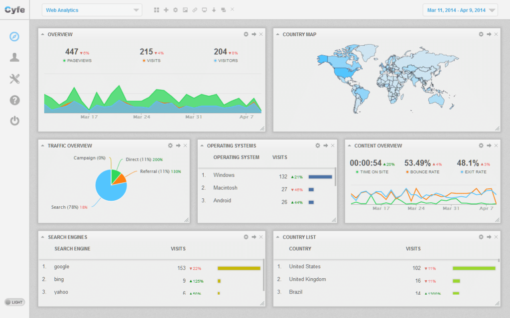
By keeping the design simple, you can better communicate different metrics for each department and help teams make more informed decisions.
5. Group specific data in dashboard components
There is nothing worse than going to a data dashboard and the information is all over the place. When you’re creating your data dashboard, focus on specific topics and groups. Grouping content together in a clear way is important to give a complete overview of data. Plus, it helps viewers access the right information, at the right time.
For example, the dashboard below separates everything and is organized to flow well throughout data segments.
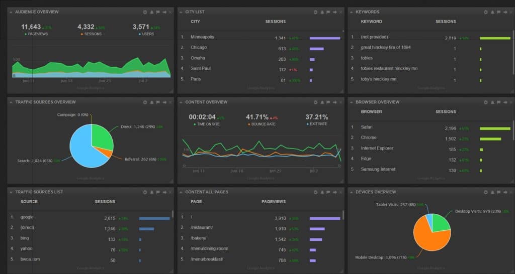
This makes it easy for viewers to read, digest, and understand the relationship between different types of data.
6. Use text blocks to communicate cause and effect
Another important thing to note is that all of your business data is related and changing. One thing in your business may affect multiple data points across many of your dashboards.
One of the hardest things to do is to spot and understand how one data point or set of data points correlates to another. With Cyfe, you can map this out in your dashboard so that it is clear how data point “X” of one widget has impacted data point “Y” of another widget. In this case, you can use a text block to explain.
We also recommend adding text blocks within your data to help identify different sections and even give your notes on how the data correlates. Doing so will make it much easier for your audience to understand what the data is telling you.
7. Create clear widget and data names
Every widget comes with a default name which can be:
- Name of the service (ex. Quickbooks, Facebook, Google Adwords, etc.)
- A data set name (ex. Facebook Likes, Quickbooks Recent Payments, etc.)
The problem is: most clients don’t know what’s being reported.Setting up a consistent and easily understood naming style so your viewer understands what data is being reported, plus, makes it easier for them to find the exact data points they are looking for.
As far as naming goes, consistency is key. Segment, a customer data analytics company, created the object-action framework to scale naming conventions.
It looks something like this:
“The idea is simple. First, choose your objects (e.g., Product, Application, etc.). Then define actions your customers can perform on those objects (e.g., Viewed, Installed, etc.). When you put it all together, your event reads Product Viewed or Application Installed.”
You can add a custom name that identifies the examined data for each point in Cyfe. This will cut down the amount of time you have to take to explain what someone is looking at. It’s also a great idea for marketing agencies to add a text block below each widget to point out trends, what the data means, and why it matters to your clients.
8. Remember to set correct time frames
It’s easy for data to lie. One of the easiest ways to have your data lie to you is to have incorrect, inaccurate, or inconsistent time frames.
If you’re preparing several pieces of data for presentation, each piece likely needs to be set to the same time frame in order to avoid confusion or false assumptions.
There are times that having different time frames are necessary. In most cases, it’s critical to clearly outline the different time frames and why they are different. The last thing that you want is the person that the data was prepared to misinterpret it because they don’t realize that the time frames are not the same.
For more on this, we recommend you check out this blog post: 4 Ways Your Data Insights Are Lying to You
9. Avoid data overload
There is so much data out there and more and more is becoming accessible by the day. This is truly the information age and it’s extremely easy to get overwhelmed and drown in your analytics. This is true for everyone from solopreneurs to Fortune 100 companies.
It’s important to remember the purpose of your dashboard and then determine which data is actually needed to make the story clear. Avoid using vanity metrics or any data that may confuse your intended audience. Simpler is always better, unless it inaccurately skews perspective.
Be sure to view your dashboard from the perspective of your viewer. It’s common that the person that is developing a data dashboard has more knowledge and experience with the data than the person receiving it. Scale back and only report on the data points that are absolutely necessary in order to prove your point.
10. Account for how you’ll share the data dashboard
This last tip builds on the last one, but it’s important to account for how you’ll share your dashboards with a client. This can change how you structure the dashboard and what information you spell out clearly.
If you’re presenting the data in person, you can leave out some text blocks and explain the data within your presentation. However, it’s more likely you’ll be sending the dashboard to your audience and they’ll view the data on their own. If this is the case, give as much detail and explanation as possible. You don’t want your audience to misinterpret a data point in the dashboard — it could result in poor business decisions and mistakes.
5 examples of data dashboards
A few popular data dashboard examples in Cyfe we’ve seen are:
The Operational Dashboard
This type of dashboard helps identify operation efficiencies, issues, and opportunities in real-time. It’ll likely include information such as:
- Website traffic from Google Analytics
- Messages through Basecamp
- Bank balances through Quickbooks and Freshbooks
- Customer support tickets via Desk or Zendesk
- Upcoming events managed in Google Calendar
More often than not, you’ll monitor the operational dashboard every day, and it’ll drive your decision-making process for business development and more.
The Strategic Dashboard
A strategic dashboard can be built for a leadership team such as C-suite, business owners, or board of directors. It tracks and analyzes key data points related to business performance and gives a high-level overview of the health of the business, including:
- trending information through Google Trends
- sales through Infusionsoft, Shopify, or Eventbrite
- conversion funnel metrics via Unbounce.
Each industry and business will have a different setup. The goal is to define metrics that are easy to understand and lead to action. When you are sharing these metrics with leadership, they should be able to understand what each metric means how it aligns with the company’s vision and objectives.
The Marketing Dashboard
A marketing dashboard is where you can track the effectiveness, progress, and return on investment of your marketing initiatives through all different channels. It can include information such as:
- Pay-per-click costs, clicks, impressions, and conversions through Google Adwords
- Call logs through Marchex
- Email marketing effectiveness through an email marketing software provider
- Moz ranks and search engine optimization progress
- Social media analytics
This dashboard will give you a good idea of what’s working and what’s not. Collecting, analyzing, and acting on data about marketing analytics and performance will give you a clear direction for building better campaigns and improve lead generation for your business.
The Financial Dashboard
Whether you’re head of your own one-person company, or you’re a manager in a 2,000+ person organization, keeping track of financials is a must. With a financial dashboard, you can keep a snapshot handy at all times including critical information such as income, expenses, sales, balances, subscriptions, proposals, etc.
No longer do you have to log into your bank accounts or account software to see data. A financial dashboard is an easy way to show the change in the value of a specific financial metric versus previous cycles — such as month over month, quarter over quarter, year over year, etc.
The Competitor Dashboard
A competitor dashboard is an underutilized type of dashboard, but can be beneficial to your business growth. Within this dashboard you can monitor your competitor’s content through an RSS feed, social media growth and content, Moz rankings, keyword rankings, traffic ranking, reach, and even page views per user.
We all want to know what our competition is doing and understand what they’re doing well and not so well so that we can capitalize and grow our business. Creating a competitor’s dashboard is the first step.